









 Ruby
Ruby
 Golang
 .Net
.Net
 MCP
MCP
 C++
C++

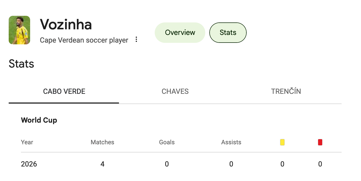
During the 2026 World Cup, Cape Verde played for the first time, and its goalkeeper Vozinha had the kind of attention that nobody could have imagined before the event started.
His Instagram following stood at roughly 27,000 before the tournament. Then Cape Verde held Spain to a goalless draw, with Vozinha stopping all eight shots on target from the 23 Spain produced. In the days after that match his following passed 14 million. By the end of the tournament it had grown past 29 million.
Vozinha's story raised a question. How many smaller versions of that story were buried across 48 teams and 104 matches?
So during the tournament, we tracked search interest, news coverage, and Instagram followers for a watchlist of players to answer a simple question. Beyond the trophy, who actually captured the world's attention?
This blog is about what the data showed, the player stories hiding in it, and what any of it can and cannot tell you.
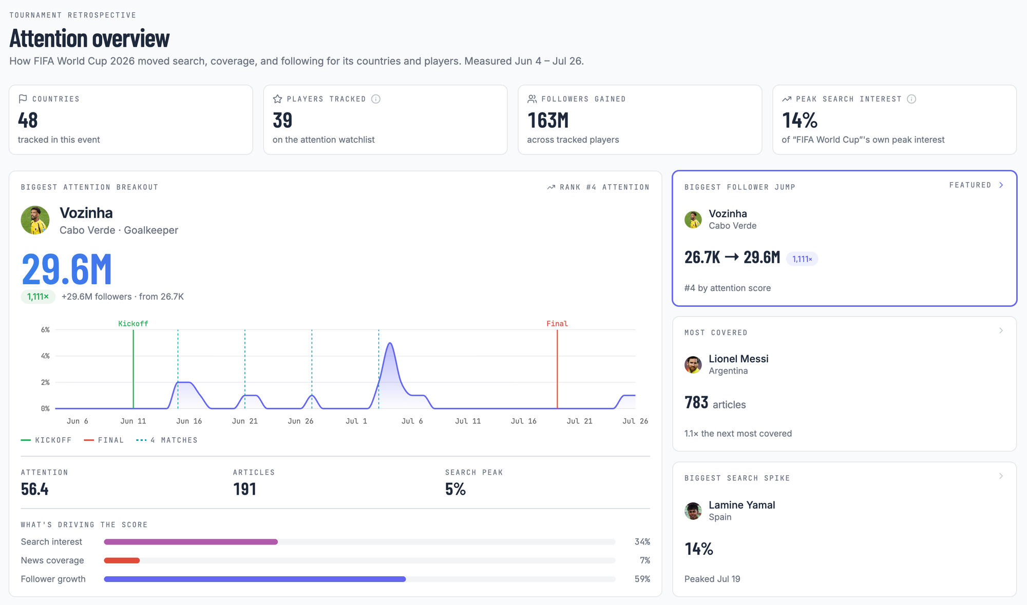
Everything in this post comes from Sports Pulse, a live dashboard I built on SerpApi's APIs to track this, the same data teams use for sponsorship scouting, media monitoring, and market research. Every number below has a page there where you can see it for yourself.

The Question That Turned Into a Dashboard
The World Cup writes down everything that happens on the pitch. Every goal, every save, every minute played. What it does not write down is who the world went looking for while it happened. That record is scattered across search queries, news archives, and follower counts, three things measured in different units and stored in different shapes. The match report tells you Vozinha played four games. It does not tell you the world went looking for him afterwards.
So I built a pipeline that assembles that second record. For every player it produces a single attention score from 0 to 100, built from three signals. Search interest, news coverage, and follower growth, each compared against the rest of the field. The score answers one narrow question.
Relative to everyone else at this tournament, how much attention did this player draw during the event?
It is not a measure of how good a player is, and it is not a measure of fame. A player who was already massively popular before the tournament and stayed that way will score low, because the score is built around movement. And it never says why something happened. A spike after a match is a spike after a match.
I scored a watchlist of 39 hand-picked players rather than the 1,248 players spread across the 48 squads. Scoring all of them means measuring hundreds of players nobody searched for, which buries the signal in noise. So I picked the players most likely to draw attention, based on their profiles going in, minutes played, and how far their team went. Less data, better data.
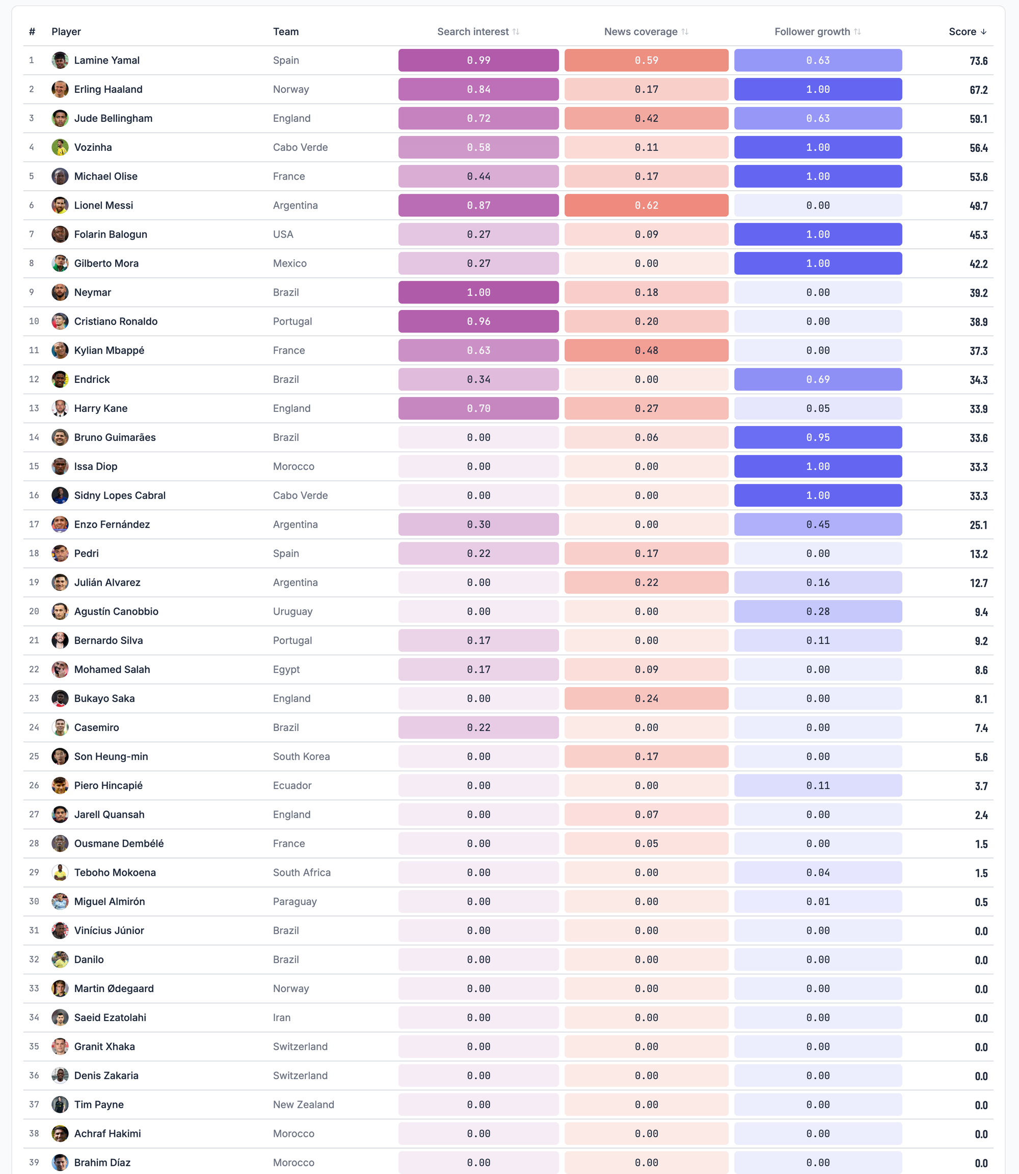
Reading the Board
The board does not rank the best players at the World Cup. It ranks who moved the most while it was happening, and the players at the top got there in completely different ways.
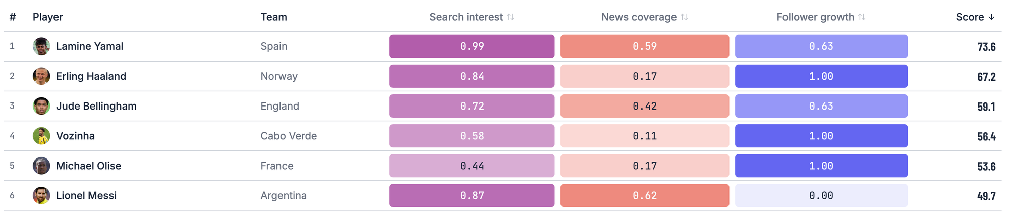
The Top Six
Lamine Yamal
Yamal finishes first with a score of 73.6, and he is the only player on the board who is strong in all three signals at once. The highest search interest of the tournament, 727 articles, and 13.7 million new followers across Spain's eight-match run to the title.
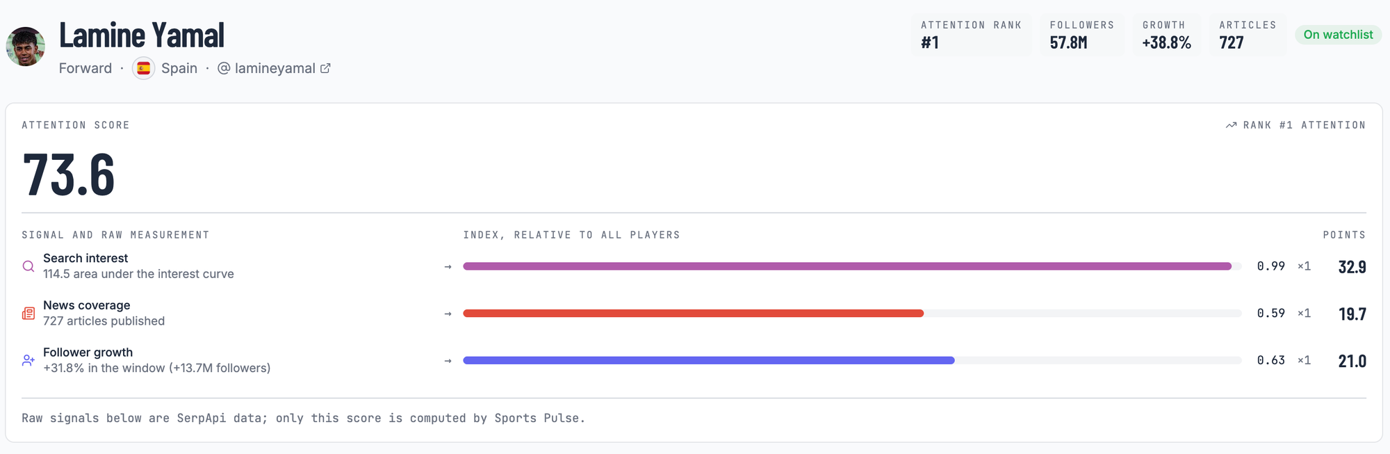
That is the sanity check. A measure of tournament attention that did not pull Yamal near the top would be measuring something else or completely wrong. What makes him unusual is not the total; it is that he has no weak column.
Vozinha
Vozinha finishes fourth with an attention score of 56.4, across four matches.
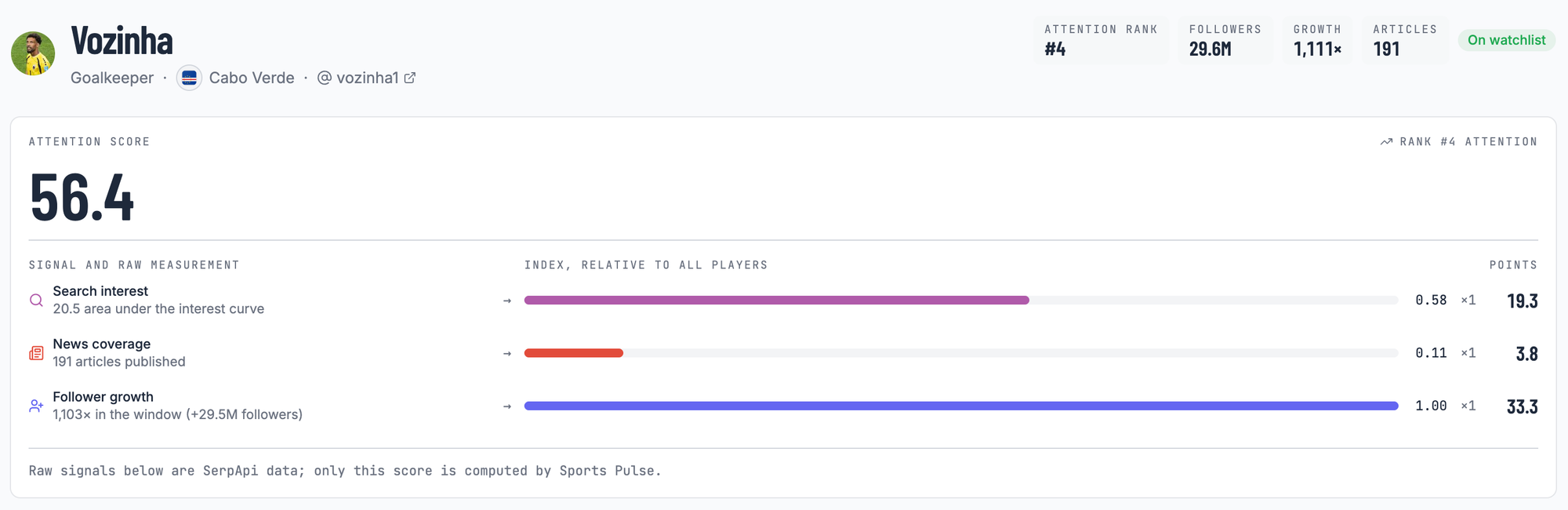
He gained 29.5 million followers during the window, the largest movement in the field by a distance nobody else is close to. His whole score rests in one column, and that is the pattern a scoreboard cannot show you and a raw follower count cannot contextualize, because a follower count on its own has no field to compare against.
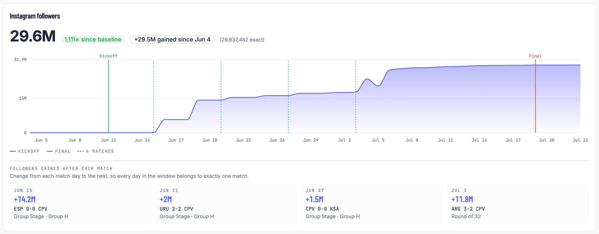
The per-match Instagram follower graph makes it concrete. The Spain match added 14.2 million followers; the Argentina match in the final added 11.8 million new followers to the Vozinha account.
Lionel Messi
Messi is the most useful player on this watchlist for understanding what the score actually measures.
He has the most news coverage of anyone at the tournament with 783 articles covering him, more than Yamal. His search interest is the second highest on the watchlist. And his follower growth scores exactly zero.
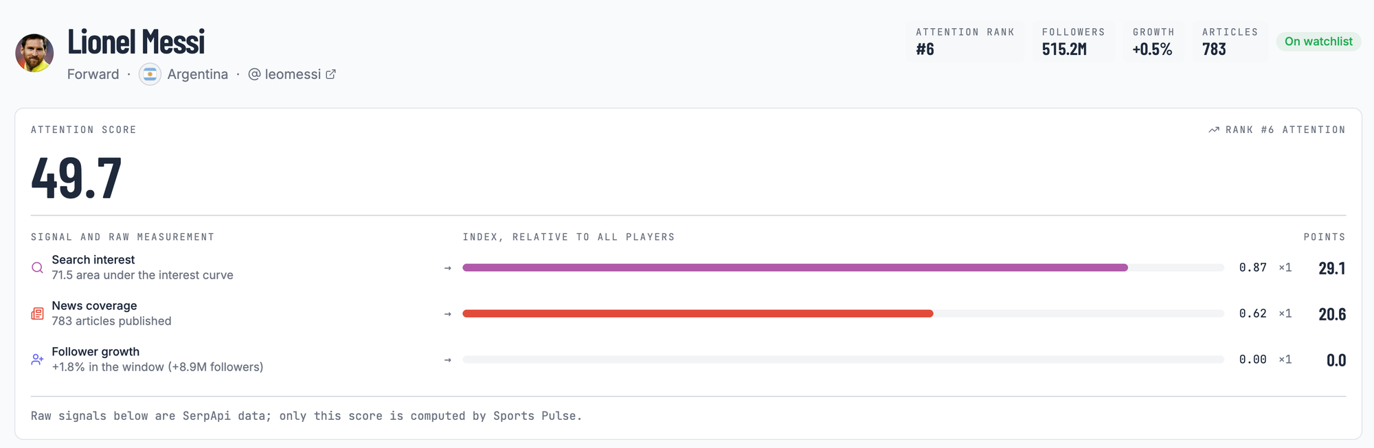
The zero is not missing data, and it is not because he stood still. Messi gained 8.9 million followers during the tournament, more than most players on the watchlist. But on a base of 515 million that is a 0.5% move, and in a field where Vozinha's following multiplied more than a thousand times over, a 0.5% move lands below the middle of the pack and scores nothing.
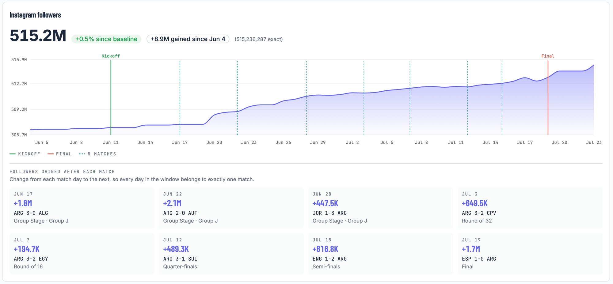
That is the metric behaving exactly as designed and it still looks strange written down. Messi finishing sixth is not a claim that five players had a bigger tournament than him. It is a claim that five players moved more than he did, which is a different sentence, and the difference is the whole point of the exercise.
Haaland and Olise
Vozinha's pattern is not a one-off. Haaland finishes second after gaining 32.8 million followers across six matches.
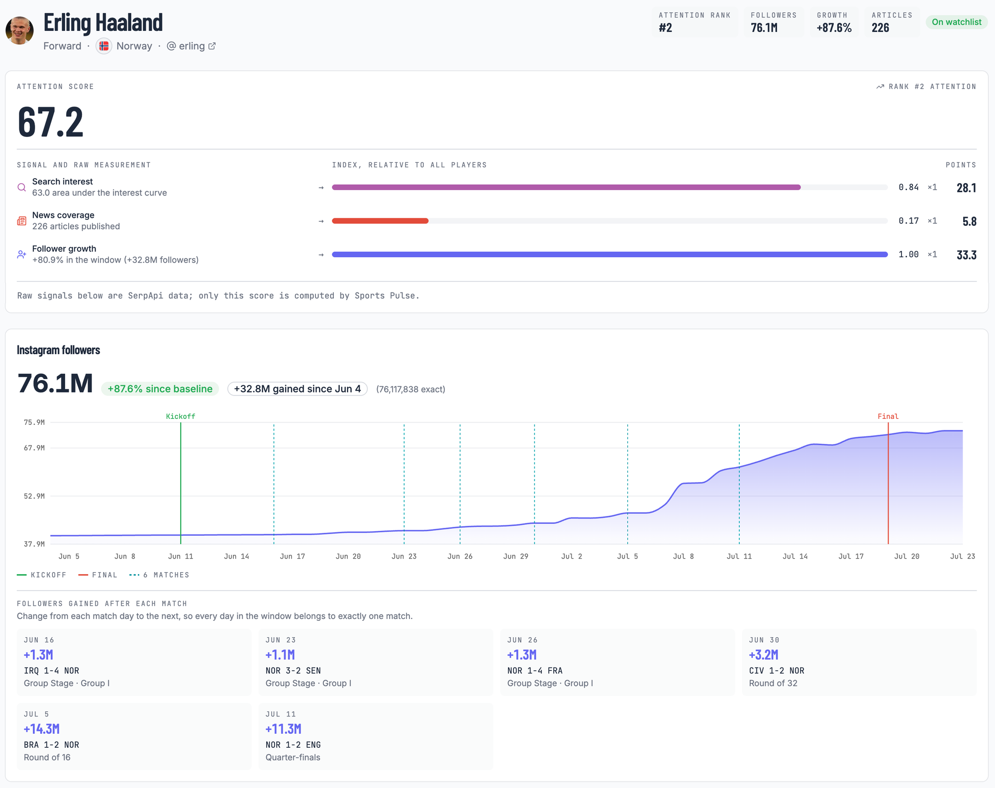
And Olise finishes fifth with 6 million gained from a far smaller base. Both maxed out the same follower signal Vozinha did.
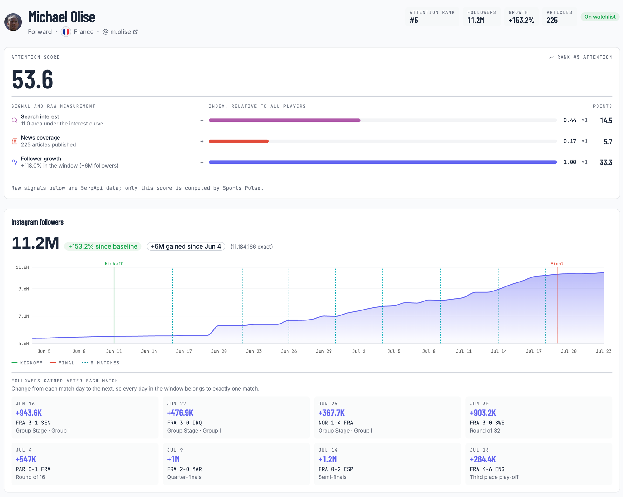
Three of the top five got there mostly on follower growth, and that is a finding about tournaments, not about the metric. While the competition is running, the audience moves faster than the press does. Reporters filed a few hundred articles about Vozinha over four weeks. Tens of millions of people tapped follow. His story shows up in follower counts first and everywhere else later.
What the Attention Turned Into
The attention score stops at the tournament window. Vozinha's story did not.
Within weeks of the final he signed with Colo Colo, one of the biggest clubs in Chile, and reports linked him with offers from several other teams, including rumors of a move to Inter Miami to share a locker room with Messi. Sponsorship offers came after. And searches for Cape Verde itself climbed alongside its goalkeeper, a country of half a million people that most of the new audience could not have placed on a map in May.
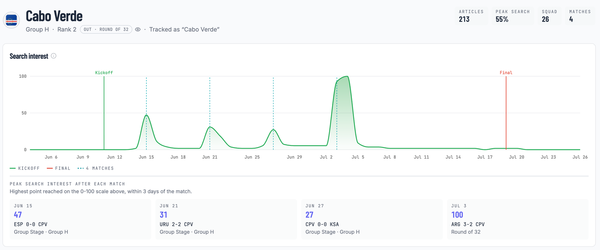
All of that happened to a 40-year-old goalkeeper, at an age when most careers are already over. The data in this post cannot tell you what caused any of it. What it can show is the moment the audience arrived, tens of millions of people in two match windows, and everything above followed while the world was watching.
What This Cannot Tell You
Three honest limits, so the numbers above are read as what they are.
- It does not explain why. The score measures attention during the tournament. A player whose following grew after a strong performance grew after a strong performance. What produced that growth is outside anything these APIs can see.
- It only knows 39 players. Every score is relative to that hand-picked field and would change if the field changed.
- It measures attention, not merit. A player can have an outstanding tournament in near silence. The score would show a low number, and it would be right about attention and say nothing about football.
How We Measured This
Everything above comes from one pipeline built on four SerpApi engines. The Google Sports API supplies the skeleton, the tournament's dates, the squads, and all 104 matches, so nobody maintains a match list by hand. On top of that skeleton, three signals are measured for every player on the watchlist over a window taken from the tournament's own dates. The Google Trends API gives search interest, the Google News API gives coverage volume, and the Instagram Profile API gives follower growth rather than raw totals, which is the difference between measuring who is already famous and measuring who is becoming famous.
The three signals arrive in three incompatible units, so each is converted to the same scale before combining into a single 0 to 100 attention score. A player with a gap in one signal is scored on the signals that exist rather than punished with a zero.
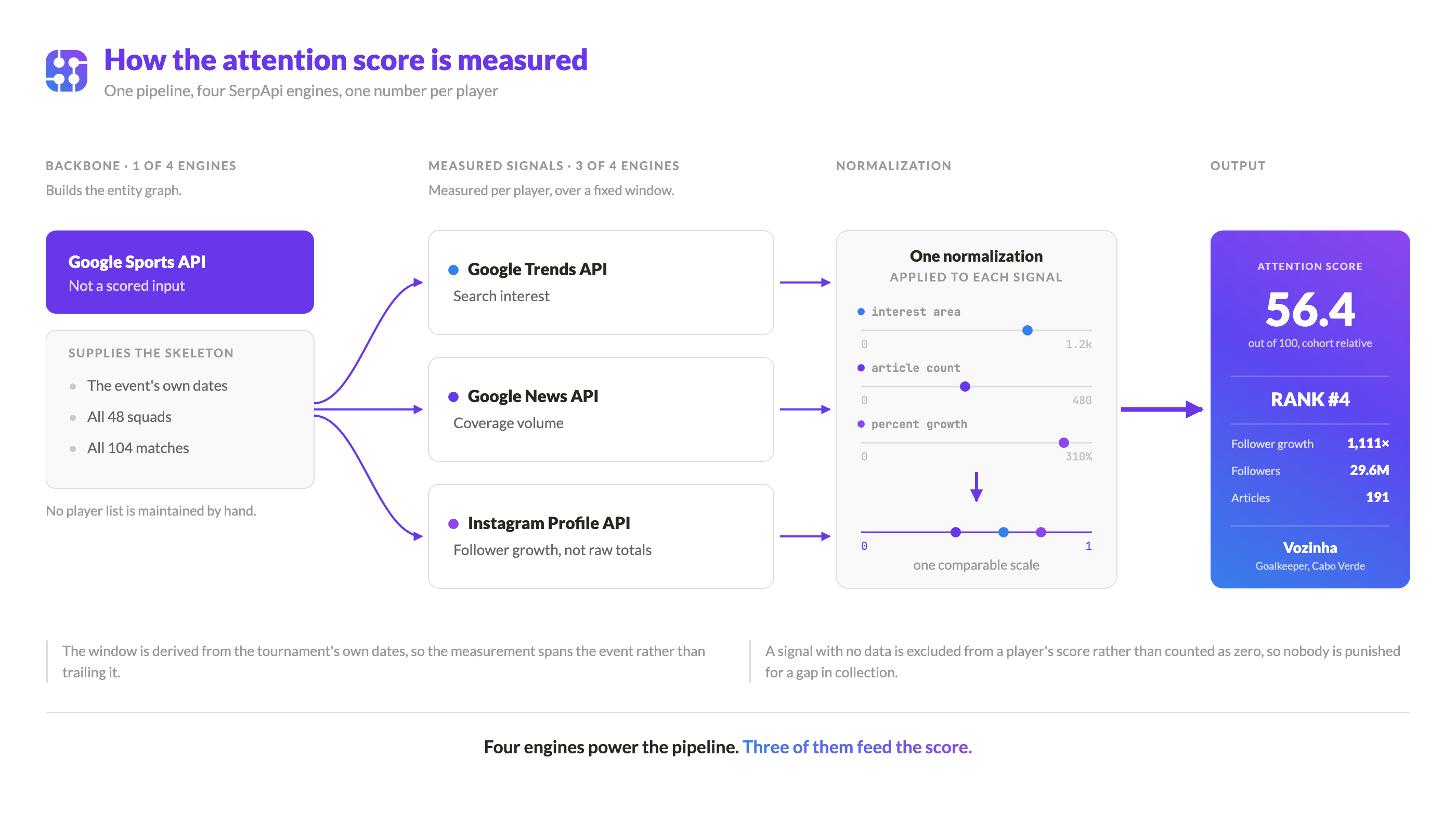
How the conversion works and how each engine is queried in practice is a story of its own, and it did not fit here.
Pointing It at the Next Tournament
Nothing in the pipeline knows it is looking at football. The window comes from the event's dates, the player list from the event's structure, and the score from comparing whoever is on the watchlist. Swap the event and the watchlist, and the same three signals work for the Champions League, the NBA, the NFL, and other sports events.
Conclusion
Yamal topped the board by being strong everywhere. Messi put up two of the biggest signals at the tournament next to a zero. And a 40-year-old goalkeeper from a country of half a million people finished fourth on a single column because tens of millions of people went looking for him at once.
One blended number would have flattened all of that into a rank. Keeping the three signals visible is what lets you say why a player is on the board, and in Vozinha's case the why is the entire story.
The dashboard is live at Sports Pulse, with the full board, per player pages with the follower and search curves, per-match breakdowns, and a page that walks through the calculation on real data. I would start with Vozinha's page. The curve is the entire reason this exists.