A fun experiment with Google Maps data is to compare businesses’ popularity. Whether you’re a business seeking new opportunities or a visitor planning your trip, this analysis can help you make better decisions. To get the popularity data, we use SerpApi’s Google Maps Scraper API. It’s one of our customers’ favorites for retrieving details like business addresses, phone numbers, and websites. We wrote another blog post that goes more in-depth about it.
First of all, we use Google Maps Scraper API to search for a list of businesses (e.g. Museum, restaurant, coffee). Below is an example in Playground. We perform a search for Museum in New York using the q and ll parameter respectively.
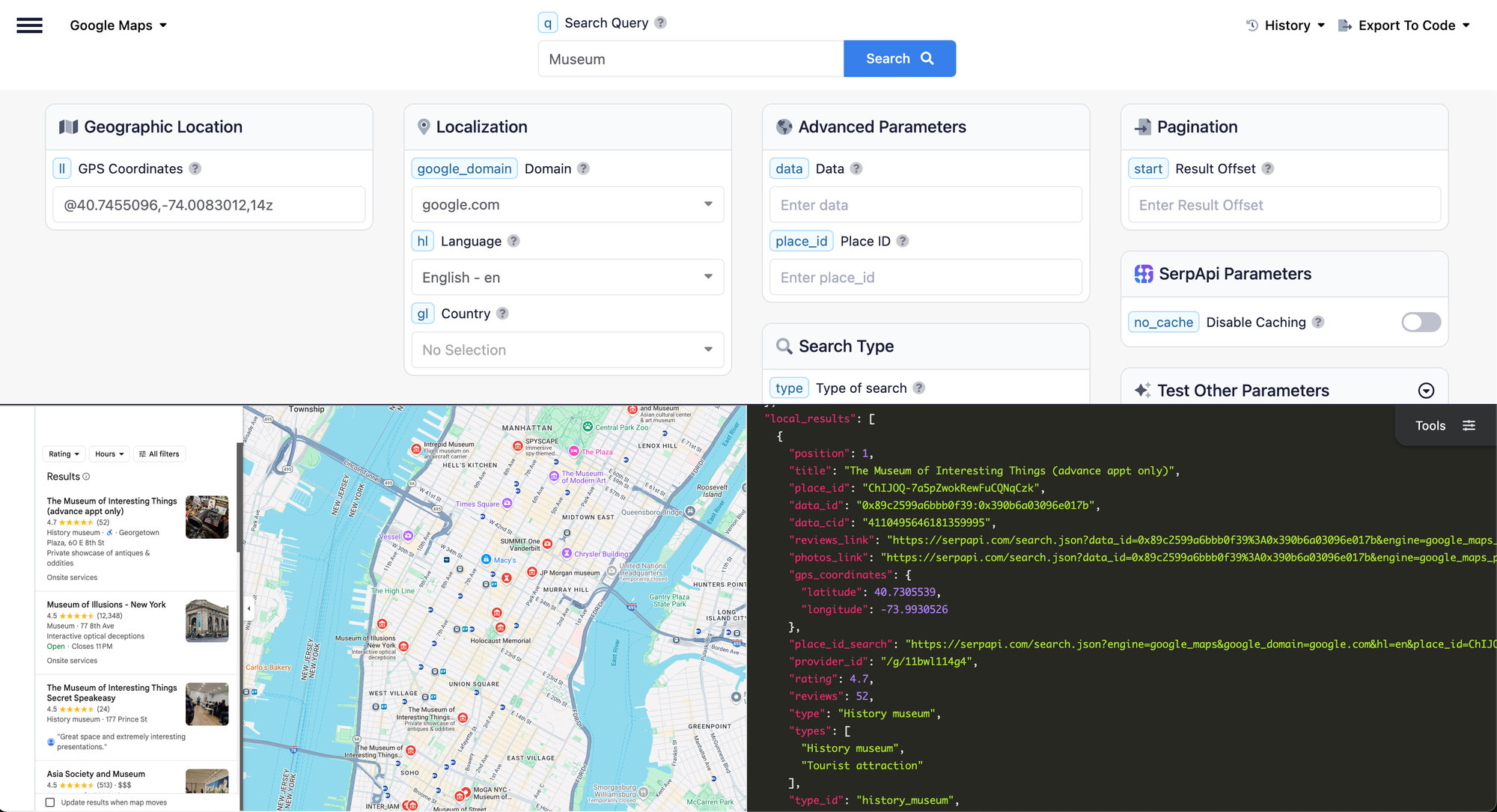
Popularity data isn't available for listing searches; it is only available in Place Results. To retrieve Place Results, we have to provide the place_id. Below is an example in Playground.
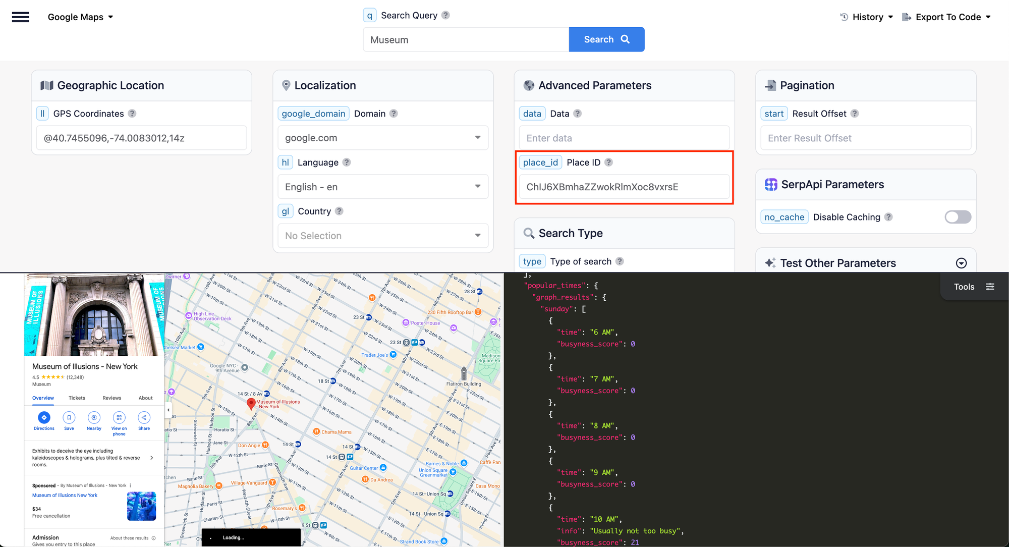
The data we need is popular_times.
"popular_times": {
    "graph_results": {
      "sunday": [
        {
          "time": "6 AM",
          "busyness_score": 0
        },
        {
          "time": "7 AM",
          "busyness_score": 0
        },
        {
          "time": "8 AM",
          "busyness_score": 0
        },
        {
          "time": "9 AM",
          "busyness_score": 0
        },
        {
          "time": "10 AM",
          "info": "Usually not too busy",
          "busyness_score": 21
        },
        {
          "time": "11 AM",
          "info": "Usually not too busy",
          "busyness_score": 35
        },
        {
          "time": "12 PM",
          "info": "Usually not too busy",
          "busyness_score": 49
        },
        {
          "time": "1 PM",
          "info": "Usually a little busy",
          "busyness_score": 64
        },
        {
          "time": "2 PM",
          "info": "Usually a little busy",
          "busyness_score": 71
        },
        {
          "time": "3 PM",
          "info": "Usually a little busy",
          "busyness_score": 75
        },
        {
          "time": "4 PM",
          "info": "Usually a little busy",
          "busyness_score": 70
        },
        {
          "time": "5 PM",
          "info": "Usually a little busy",
          "busyness_score": 63
        },
        {
          "time": "6 PM",
          "info": "Usually a little busy",
          "busyness_score": 51
        },
        {
          "time": "7 PM",
          "info": "Usually not too busy",
          "busyness_score": 41
        },
        {
          "time": "8 PM",
          "info": "Usually not too busy",
          "busyness_score": 29
        },
        {
          "time": "9 PM",
          "info": "Usually not too busy",
          "busyness_score": 21
        },
        {
          "time": "10 PM",
          "info": "Usually not busy",
          "busyness_score": 15
        },
        {
          "time": "11 PM",
          "busyness_score": 0
        }
      ],
      ...
    },
    ...
}
Doing it in code
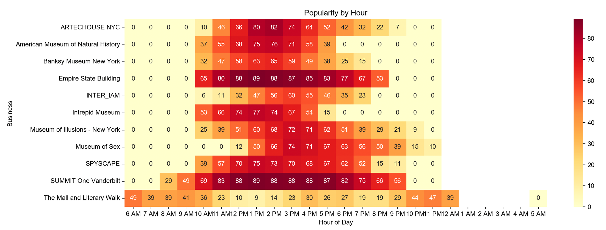
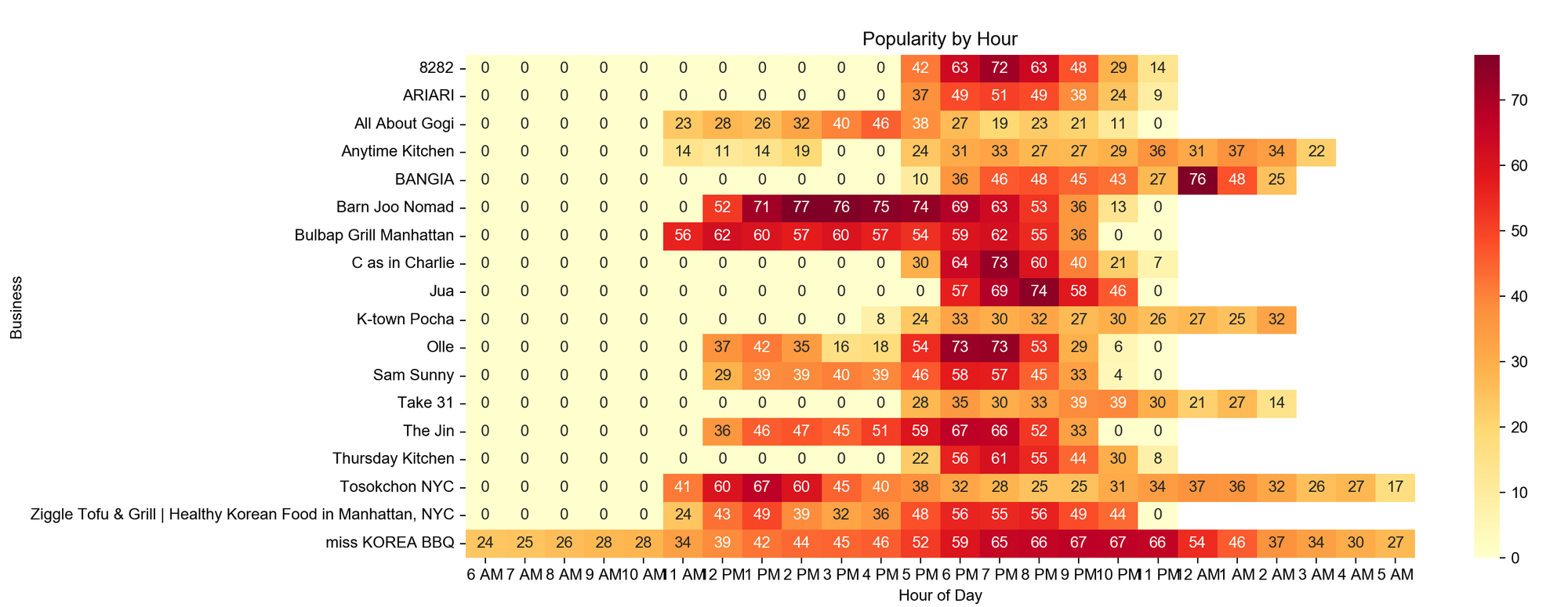
We will use this data to create a graph that better visualizes the popularity of businesses. A heatmap graph is excellent for this as it provides a clear visual representation of the varying levels of popularity across different businesses. By using a heatmap, we can easily identify trends, peak times, and the most popular businesses at a glance.

In the find_businesses_and_popularities method, the process follows a similar flow to what we previously explained. It first retrieves the listings based on the search query and the coordinates provided. Then, it iterates through each item in the list to fetch the details of each business.
*API Key can be retrieved from the dashboard.
from serpapi import SerpApiClient
SerpApiClient.SERP_API_KEY = "<Your API Key>"

def find_businesses_and_popularities(query, ll):
    search_results = SerpApiClient(
        params_dict={"q": query, "ll": ll},
        engine="google_maps"
    ).get_dict()["local_results"]

    tasks = []
    for result in search_results:
        task = SerpApiClient(
            params_dict={"place_id": result["place_id"]},
            engine="google_maps"
        ).get_dict()
        tasks.append((result, task))

    for result, place_data in tasks:
        result["popular_times"] = place_data["place_results"].get("popular_times")

    return search_results

local_results = find_businesses_and_popularities("Museum", "@40.7455096,-74.0083012,14z")
The data is not yet in a usable format; we need to flatten it into the following structure:
[
  {"business": "...", "time": "6 AM", "busyness_score": 41},
  {"business": "...", "time": "7 AM", "busyness_score": 59},
  {"business": "...", "time": "8 AM", "busyness_score": 53},
  ...
]
data = []
for result in local_results:
if result["popular_times"] is not None:
for time_results in result["popular_times"]["graph_results"].values():
for time_result in time_results:
data.append({
"business": result["title"],
"time": time_result["time"].replace("\u202f", " "),
"busyness_score": time_result["busyness_score"],
})It is time to plot the graph!
import seaborn as sns
import matplotlib.pyplot as plt
import pandas as pd

# Make sure we can display unicode character
plt.rcParams['font.sans-serif'] = ['Arial Unicode MS']
plt.rcParams['axes.unicode_minus'] = False

columns = ["6 AM", "7 AM", "8 AM", "9 AM", "10 AM", "11 AM", "12 PM", "1 PM", "2 PM", "3 PM", "4 PM", "5 PM", "6 PM", "7 PM", "8 PM", "9 PM", "10 PM", "11 PM", "12 AM", "1 AM", "2 AM", "3 AM", "4 AM", "5 AM"]
df = pd.DataFrame(data)
heat_data = df.pivot_table(
                index='business',
                columns='time',
                values='busyness_score',
                aggfunc='mean'
            ).reindex(columns=columns)

plt.figure(figsize=(len(columns), 4))
sns.heatmap(heat_data, cmap='YlOrRd', annot=True, fmt='.0f')
plt.title('Popularity by Hour')
plt.xlabel('Hour of Day')
plt.ylabel('Business')
plt.show()
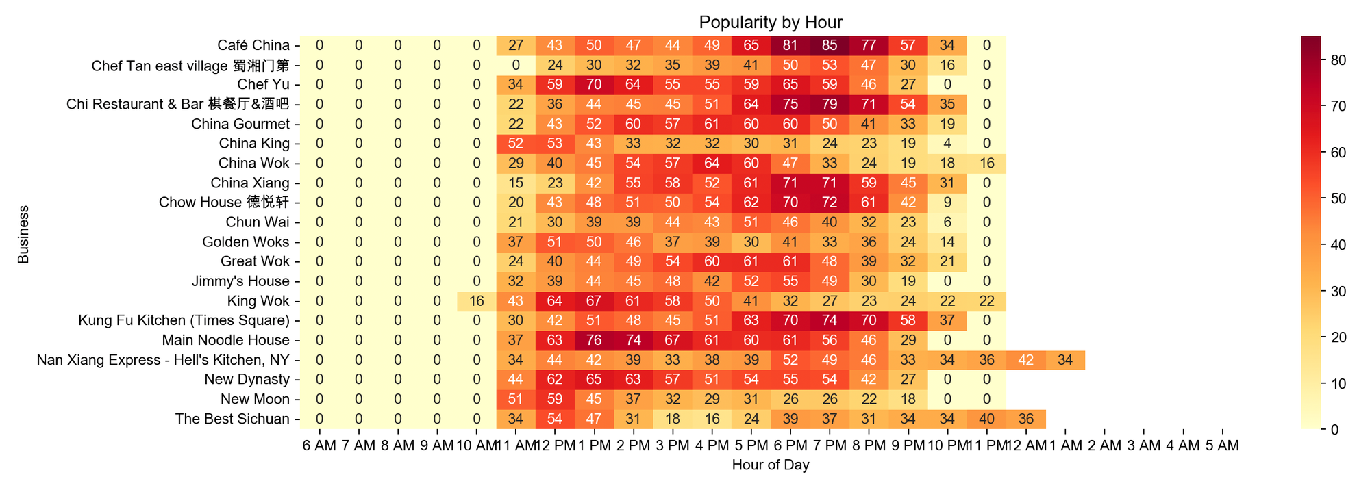
This graph represents data for the entire week. We use mean calculations to obtain an accurate overview. Feel free to modify the code to view them on a specific day or on the weekend.
Museum in New York
Coffee shop in New York

Chinese Restaurant in New York
Korean Restaurant in New York
Conclusion
It's interesting to see some businesses peak at a certain period (lunch, dinner time) and some businesses peak almost the entire opening period. There are other interesting data points to be used in Google Maps, feel free to check them out!
